Building a Semantic Search Engine with Qdrant & Encore.ts
Create powerful semantic search using OpenAI embeddings and Qdrant vector database

In this tutorial, we'll build a semantic search engine that uses OpenAI embeddings and Qdrant vector database to enable powerful semantic search capabilities. The app will allow users to search through documents using natural language queries, finding relevant content even when the exact words don't match.
For example, if you search for "renewable power sources", it will find documents about "solar panels" and "wind turbines" even though those exact terms weren't in your query. Or search for "machine learning basics" and discover articles titled "Introduction to AI" or "Getting Started with Neural Networks". This can be very useful for building intelligent documentation search, internal knowledge bases, or customer support systems where users might not know the exact terminology but can describe what they're looking for conceptually.
Want to build this faster? Try using Leap to generate this entire application with a simple prompt like "Build a semantic search engine with OpenAI embeddings and Qdrant vector database." Leap can scaffold the complete backend and frontend code, letting you focus on customization rather than boilerplate.
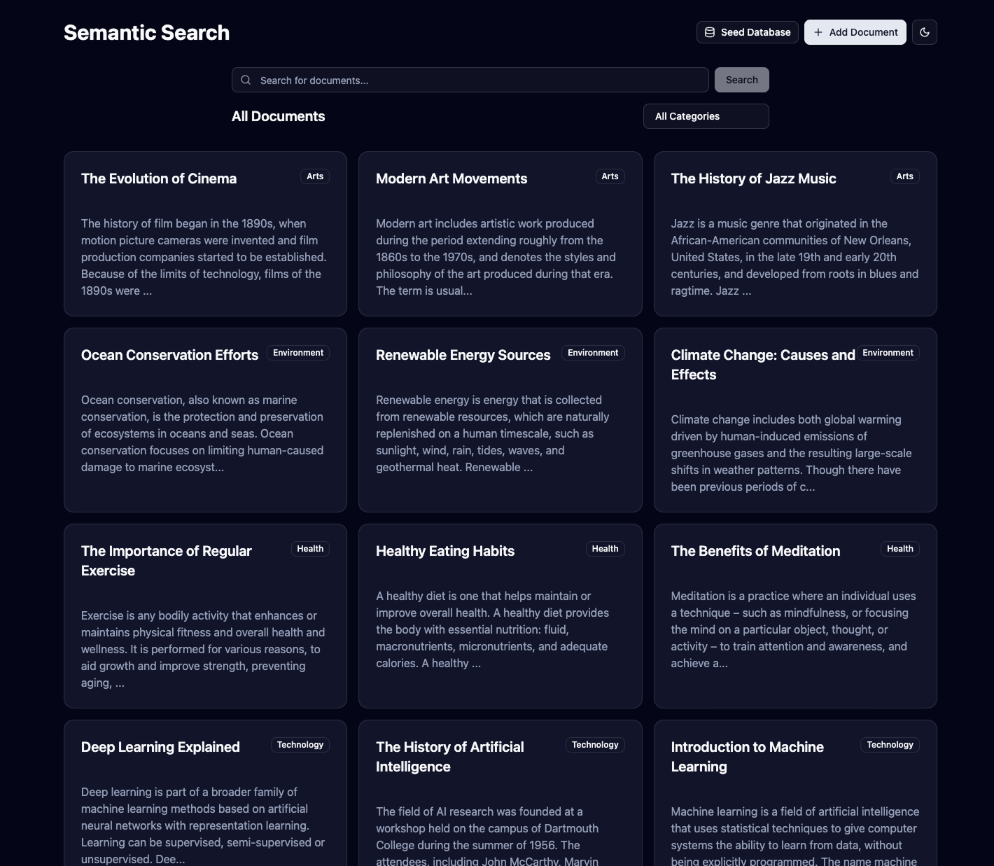
This is what the end result should look like:
Getting Started
To get started, you'll need Encore installed on your machine:
$ brew install encoredev/tap/encoreOnce that's ready, we can create our project:
encore app create semantic-search --example=hello-world
Backend Implementation
We'll structure our semantic search application as a single service that handles all document operations. In Encore, a service is a logical grouping of related functionality—in our case, everything related to document storage, embedding generation, and search.
1. Setting Up the Search Service
Let's create a dedicated search service that will be responsible for:
- Storing and managing documents in our SQL database
- Generating embeddings using OpenAI's API
- Indexing vectors in Qdrant for fast semantic search
- Exposing search and document management APIs
First, create the service directory:
mkdir backend/search
Now define the service by creating backend/search/encore.service.ts:
import { Service } from "encore.dev/service";

export default new Service("search");
This tells Encore that the search directory (and all its subdirectories) contains a service called "search". Encore will automatically discover all APIs, databases, and other resources we define within this service and wire everything together.
2. Database Setup
We'll use a traditional SQL database to store our document metadata (title, content, category, etc.). While the actual semantic search happens in our vector database, we need to store the original documents somewhere accessible and queryable.
Create backend/search/migrations/1_create_tables.up.sql:
CREATE TABLE documents (
  id BIGSERIAL PRIMARY KEY,
  title TEXT NOT NULL,
  content TEXT NOT NULL,
  category TEXT NOT NULL,
  created_at TIMESTAMP WITH TIME ZONE NOT NULL DEFAULT NOW()
);

CREATE INDEX idx_documents_category ON documents(category);
This schema stores our documents with a category index for efficient filtering. The id field will be used to link between our SQL records and vector database entries.
Create backend/search/db.ts to initialize the database:
import { SQLDatabase } from "encore.dev/storage/sqldb";

export const searchDB = new SQLDatabase("search", {
  migrations: "./migrations",
});
Encore will automatically create and migrate this database when you run your application.
3. Setting Up OpenAI Integration
We'll use OpenAI's embedding models to convert human-readable text into high-dimensional vectors that capture semantic meaning. The text-embedding-3-small model creates 1,536-dimensional vectors that encode the contextual meaning of text.
Create backend/search/embeddings.ts:
import { secret } from "encore.dev/config";
import OpenAI from "openai";

export const openaiApiKey = secret("OpenAIApiKey");

export function getOpenAIClient(): OpenAI {
  return new OpenAI({
    apiKey: openaiApiKey(),
  });
}

export async function generateEmbedding(text: string): Promise<number[]> {
  const openai = getOpenAIClient();

  try {
    const response = await openai.embeddings.create({
      model: "text-embedding-3-small",
      input: text,
    });

    return response.data[0].embedding;
  } catch (error) {
    console.error("Failed to generate embedding:", error);
    throw error;
  }
}
We're using text-embedding-3-small because it offers a good balance of performance and cost. For production applications with higher accuracy requirements, you might consider text-embedding-3-large.
4. Setting Up Qdrant Vector Database
Qdrant is a vector database optimized for similarity search. Unlike traditional databases that work with exact matches, vector databases excel at finding "similar" items based on mathematical distance between vectors.
Create backend/search/qdrant.ts:
import { secret } from "encore.dev/config";
import { QdrantClient } from "@qdrant/js-client-rest";

export const qdrantApiKey = secret("QdrantApiKey");
export const qdrantUrl = secret("QdrantUrl");
export const COLLECTION_NAME = "documents";
export const VECTOR_SIZE = 1536;

export function getQdrantClient(): QdrantClient {
  return new QdrantClient({
    url: qdrantUrl(),
    apiKey: qdrantApiKey(),
  });
}

export async function initQdrantCollection(): Promise<void> {
  const client = getQdrantClient();

  try {
    const collections = await client.getCollections();
    const collectionExists = collections.collections.some(
      (collection) => collection.name === COLLECTION_NAME
    );

    if (!collectionExists) {
      await client.createCollection(COLLECTION_NAME, {
        vectors: {
          size: VECTOR_SIZE,
          distance: "Cosine",
        },
        optimizers_config: {
          default_segment_number: 2,
        },
        replication_factor: 1,
      });

      await client.createPayloadIndex(COLLECTION_NAME, {
        field_name: "category",
        field_schema: "keyword",
      });
    }
  } catch (error) {
    console.error("Failed to initialize Qdrant collection:", error);
    throw error;
  }
}
We're using cosine similarity as our distance metric, which works well for text embeddings. The collection initialization is idempotent—it will only create the collection if it doesn't already exist.
5. Defining Data Types
Before we implement our APIs, let's define the TypeScript interfaces that will ensure type safety across our application. These types define the shape of our requests and responses.
Create backend/search/types.ts:
export interface Document {
  id: number;
  title: string;
  content: string;
  category: string;
  created_at: Date;
}

export interface CreateDocumentRequest {
  title: string;
  content: string;
  category: string;
}

export interface SearchRequest {
  query: string;
  category?: string;
  limit?: number;
}

export interface SearchResult {
  document: Document;
  score: number;
}

export interface SearchResponse {
  results: SearchResult[];
}

export interface ListDocumentsRequest {
  category?: string;
  limit?: number;
  offset?: number;
}

export interface ListDocumentsResponse {
  documents: Document[];
  total: number;
}

export interface GetDocumentRequest {
  id: number;
}
The SearchResult interface combines the original document with a relevance score from the vector search, allowing the frontend to display how well each result matches the query.
6. Implementing the Search API
Now for the core functionality: the search endpoint. This API will take a natural language query, convert it to a vector, search for similar vectors in Qdrant, and return the corresponding documents.
Create backend/search/search.ts:
import { api } from "encore.dev/api";
import { APIError } from "encore.dev/api";
import { searchDB } from "./db";
import { getQdrantClient, COLLECTION_NAME } from "./qdrant";
import { generateEmbedding } from "./embeddings";
import { SearchRequest, SearchResponse, Document, SearchResult } from "./types";

export const search = api<SearchRequest, SearchResponse>(
  { method: "POST", path: "/search", expose: true },
  async (req) => {
    try {
      if (!req.query) {
        throw APIError.invalidArgument("Search query is required");
      }

      const limit = req.limit || 10;
      const queryEmbedding = await generateEmbedding(req.query);

      const filter = req.category
        ? {
            must: [
              {
                key: "category",
                match: {
                  value: req.category,
                },
              },
            ],
          }
        : undefined;

      const qdrantClient = getQdrantClient();
      const searchResults = await qdrantClient.search(COLLECTION_NAME, {
        vector: queryEmbedding,
        limit: limit,
        filter: filter,
        with_payload: true,
      });

      if (searchResults.length === 0) {
        return { results: [] };
      }

      const documentIds = searchResults.map((result) => result.id);

      const documents = await searchDB.queryAll<Document>`
        SELECT id, title, content, category, created_at
        FROM documents
        WHERE id = ANY(${documentIds})
        ORDER BY ARRAY_POSITION(${documentIds}::bigint[], id)
      `;

      const results: SearchResult[] = searchResults.map((result) => {
        const document = documents.find((doc) => doc.id === result.id);
        if (!document) {
          throw new Error(`Document with ID ${result.id} not found`);
        }
        return {
          document,
          score: result.score,
        };
      });

      return { results };
    } catch (error) {
      console.error("Error searching documents:", error);
      if (error instanceof APIError) {
        throw error;
      }
      throw APIError.internal("Failed to search documents");
    }
  }
);
This endpoint performs a fascinating dance between three systems: it converts your query to a vector using OpenAI, searches for similar vectors in Qdrant, then fetches the full document details from PostgreSQL. The results maintain the relevance ordering from the vector search.
7. Adding Document Management APIs
Let's add endpoints to create and list documents. These will handle the full workflow of storing documents in SQL and indexing their embeddings in Qdrant.
Create backend/search/documents.ts:
import { api } from "encore.dev/api";
import { APIError } from "encore.dev/api";
import { searchDB } from "./db";
import { getQdrantClient, COLLECTION_NAME, initQdrantCollection } from "./qdrant";
import { generateEmbedding } from "./embeddings";
import {
  Document,
  CreateDocumentRequest,
  ListDocumentsRequest,
  ListDocumentsResponse,
  GetDocumentRequest,
} from "./types";

export const create = api<CreateDocumentRequest, Document>(
  { method: "POST", path: "/documents", expose: true },
  async (req) => {
    try {
      // Ensure Qdrant collection exists
      await initQdrantCollection();

      // Store document in SQL database
      const document = await searchDB.queryRow<Document>`
        INSERT INTO documents (title, content, category)
        VALUES (${req.title}, ${req.content}, ${req.category})
        RETURNING id, title, content, category, created_at
      `;

      // Generate embedding for the document content
      const embedding = await generateEmbedding(
        `${req.title} ${req.content}`
      );

      // Store vector in Qdrant
      const qdrantClient = getQdrantClient();
      await qdrantClient.upsert(COLLECTION_NAME, {
        wait: true,
        points: [
          {
            id: document.id,
            vector: embedding,
            payload: {
              category: req.category,
            },
          },
        ],
      });

      return document;
    } catch (error) {
      console.error("Error creating document:", error);
      throw APIError.internal("Failed to create document");
    }
  }
);

export const list = api<ListDocumentsRequest, ListDocumentsResponse>(
  { method: "GET", path: "/documents", expose: true },
  async (req) => {
    try {
      const limit = req.limit || 50;
      const offset = req.offset || 0;

      let query;
      if (req.category) {
        query = searchDB.queryAll<Document>`
          SELECT id, title, content, category, created_at
          FROM documents
          WHERE category = ${req.category}
          ORDER BY created_at DESC
          LIMIT ${limit} OFFSET ${offset}
        `;
      } else {
        query = searchDB.queryAll<Document>`
          SELECT id, title, content, category, created_at
          FROM documents
          ORDER BY created_at DESC
          LIMIT ${limit} OFFSET ${offset}
        `;
      }

      const documents = await query;

      // Get total count
      const countQuery = req.category
        ? searchDB.queryRow<{ count: number }>`
            SELECT COUNT(*) as count FROM documents WHERE category = ${req.category}
          `
        : searchDB.queryRow<{ count: number }>`
            SELECT COUNT(*) as count FROM documents
          `;

      const { count } = await countQuery;

      return {
        documents,
        total: count,
      };
    } catch (error) {
      console.error("Error listing documents:", error);
      throw APIError.internal("Failed to list documents");
    }
  }
);

export const get = api<GetDocumentRequest, Document>(
  { method: "GET", path: "/documents/:id", expose: true },
  async (req) => {
    try {
      const document = await searchDB.queryRow<Document>`
        SELECT id, title, content, category, created_at
        FROM documents
        WHERE id = ${req.id}
      `;

      return document;
    } catch (error) {
      console.error("Error getting document:", error);
      throw APIError.internal("Failed to get document");
    }
  }
);
The create endpoint demonstrates the key workflow: store the document in SQL, generate an embedding from the title and content combined, then index that vector in Qdrant with the document ID as the key.
8. Adding a Seed Endpoint
For testing and demo purposes, let's add an endpoint that populates our database with sample documents:
Create backend/search/seed.ts:
import { api } from "encore.dev/api";
import { APIError } from "encore.dev/api";
import { create } from "./documents";

const sampleDocuments = [
  {
    title: "Introduction to Machine Learning",
    content: "Machine learning is a subset of artificial intelligence that focuses on algorithms that can learn from data. It enables computers to learn and make decisions without being explicitly programmed for every scenario.",
    category: "technology"
  },
  {
    title: "Renewable Energy Solutions",
    content: "Solar panels and wind turbines are becoming increasingly cost-effective. These renewable power sources are essential for sustainable development and reducing carbon emissions.",
    category: "science"
  },
  {
    title: "Digital Marketing Strategies",
    content: "Modern marketing requires a multi-channel approach including social media, content marketing, SEO, and email campaigns to reach customers effectively.",
    category: "business"
  },
  {
    title: "Healthy Eating Habits",
    content: "A balanced diet rich in fruits, vegetables, lean proteins, and whole grains supports overall health and wellness. Regular meal planning can help maintain nutritious eating patterns.",
    category: "health"
  },
  {
    title: "Remote Work Best Practices",
    content: "Working from home effectively requires good communication tools, dedicated workspace, time management skills, and maintaining work-life balance.",
    category: "business"
  }
];

export const seed = api(
  { method: "POST", path: "/seed", expose: true },
  async () => {
    try {
      const results = [];

      for (const doc of sampleDocuments) {
        const result = await create(doc);
        results.push(result);
      }

      return {
        message: `Successfully seeded ${results.length} documents`,
        documents: results
      };
    } catch (error) {
      console.error("Error seeding documents:", error);
      throw APIError.internal("Failed to seed documents");
    }
  }
);
This gives you some test data to experiment with right away.
9. Setting Up Secrets
You'll need to configure the external service credentials for OpenAI and Qdrant.
Getting your OpenAI API Key:
- Go to OpenAI's website and sign up or log in
- Navigate to the API Keys page
- Click "Create new secret key"
- Give your key a name (e.g., "Semantic Search App")
- Copy the generated API key (it starts with
sk-)
Getting your Qdrant credentials:
- Go to Qdrant Cloud and create an account
- Create a new cluster (the free tier includes 1GB storage)
- Once your cluster is ready, go to the "Data Access" tab
- Copy your API Key and Cluster URL
Setting the secrets in Encore:
encore secret set OpenAIApiKey
# Paste your OpenAI API key when prompted

encore secret set QdrantApiKey
# Paste your Qdrant API key when prompted

encore secret set QdrantUrl
# Enter your Qdrant cluster URL (e.g., https://your-cluster.qdrant.tech)
10. Test Your Backend
Start your Encore application:
encore run
Navigate to http://localhost:9400 to see the Encore developer dashboard. You can test your APIs directly in the API explorer:
- First, run the
/seedendpoint to populate some test data - Try the
/searchendpoint with queries like "artificial intelligence" or "sustainable energy" - Notice how it finds relevant documents even when your search terms don't exactly match the content
The beauty of semantic search becomes apparent when you search for "AI" and get results about "machine learning," or search for "green energy" and find documents about "solar panels."
Frontend Implementation
1. Initialize Project
First, create the frontend directory and set up a React TypeScript project with Vite:
mkdir frontend
cd frontend
npm init vite . -- --template react-ts
npm install
2. Install Dependencies
Install all the necessary dependencies for our semantic search frontend:
# Core dependencies
npm install @tanstack/react-query @hookform/resolvers zod react-hook-form

# UI and styling
npm install lucide-react clsx tailwind-merge class-variance-authority

# Radix UI components
npm install @radix-ui/react-dialog @radix-ui/react-dropdown-menu @radix-ui/react-slot @radix-ui/react-toast

# Tailwind CSS
npm install tailwindcss @tailwindcss/vite
3. Configure Tailwind and Vite
Update vite.config.ts:
import { defineConfig } from 'vite'
import react from '@vitejs/plugin-react'
import tailwindcss from '@tailwindcss/vite'
import path from "path"

export default defineConfig({
  plugins: [react(), tailwindcss()],
  resolve: {
    alias: {
      "@": path.resolve(__dirname, "./src"),
      "~backend": path.resolve(__dirname, "../backend"),
    },
  },
})
Add Tailwind to your src/index.css file:
@tailwind base;
@tailwind components;
@tailwind utilities;
4. Setup shadcn/ui
Initialize shadcn/ui:
npx shadcn@latest init
Choose Slate as the base color when prompted.
Add the required shadcn/ui components:
npx shadcn@latest add button
npx shadcn@latest add input
npx shadcn@latest add dialog
npx shadcn@latest add dropdown-menu
npx shadcn@latest add card
npx shadcn@latest add form
npx shadcn@latest add textarea
npx shadcn@latest add select
npx shadcn@latest add badge
npx shadcn@latest add sonner
5. Generate Backend Client
Update package.json to add the client generation script (see here for more info):
{
  "scripts": {
    "dev": "vite",
    "build": "tsc && vite build",
    "lint": "eslint . --ext ts,tsx --report-unused-disable-directives --max-warnings 0",
    "preview": "vite preview",
    "generate-client:local": "encore gen client --output=./src/client.ts --env=local"
  }
}
Generate the backend client:
npm run generate-client:local
6. Frontend Components
You'll need to create several React components for the search interface. You can either build these yourself following modern React patterns, or copy the complete implementation beneath the toggle below:
frontend/App.tsx:
import { useState } from "react";
import { QueryClient, QueryClientProvider } from "@tanstack/react-query";
import { Toaster } from "@/components/ui/toaster";
import { ThemeProvider } from "@/components/theme-provider";
import SearchPage from "./pages/SearchPage";

const queryClient = new QueryClient();

export default function App() {
  return (
    <ThemeProvider defaultTheme="system" storageKey="semantic-search-theme">
      <QueryClientProvider client={queryClient}>
        <AppInner />
        <Toaster />
      </QueryClientProvider>
    </ThemeProvider>
  );
}

function AppInner() {
  return (
    <div className="min-h-screen bg-background">
      <SearchPage />
    </div>
  );
}
frontend/components/SearchBar.tsx:
import { useState } from "react";
import { Search } from "lucide-react";
import { Input } from "@/components/ui/input";
import { Button } from "@/components/ui/button";

interface SearchBarProps {
  onSearch: (query: string) => void;
  isLoading: boolean;
}

export function SearchBar({ onSearch, isLoading }: SearchBarProps) {
  const [query, setQuery] = useState("");

  const handleSubmit = (e: React.FormEvent) => {
    e.preventDefault();
    if (query.trim()) {
      onSearch(query);
    }
  };

  return (
    <form onSubmit={handleSubmit} className="flex w-full max-w-3xl gap-2">
      <div className="relative flex-1">
        <Search className="absolute left-3 top-1/2 h-4 w-4 -translate-y-1/2 text-muted-foreground" />
        <Input
          type="text"
          placeholder="Search for documents..."
          className="pl-10"
          value={query}
          onChange={(e) => setQuery(e.target.value)}
        />
      </div>
      <Button type="submit" disabled={isLoading || !query.trim()}>
        {isLoading ? "Searching..." : "Search"}
      </Button>
    </form>
  );
}
frontend/components/DocumentCard.tsx:
import { Card, CardContent, CardDescription, CardHeader, CardTitle } from "@/components/ui/card";
import { Badge } from "@/components/ui/badge";
import type { Document } from "~backend/search/types";

interface DocumentCardProps {
  document: Document;
  score?: number;
  highlightQuery?: string;
}

export function DocumentCard({ document, score, highlightQuery }: DocumentCardProps) {
  const highlightContent = (content: string, query: string) => {
    if (!query) return content;
    const parts = content.split(new RegExp(`(${query})`, 'gi'));
    return parts.map((part, i) =>
      part.toLowerCase() === query.toLowerCase() ?
        <span key={i} className="bg-yellow-200 dark:bg-yellow-800">{part}</span> :
        part
    );
  };

  const truncateContent = (content: string, maxLength = 200) => {
    if (content.length <= maxLength) return content;
    return content.substring(0, maxLength) + "...";
  };

  return (
    <Card className="transition-all hover:shadow-md">
      <CardHeader className="pb-2">
        <div className="flex items-start justify-between">
          <CardTitle className="text-xl">{document.title}</CardTitle>
          <Badge variant="outline" className="capitalize">
            {document.category}
          </Badge>
        </div>
        {score !== undefined && (
          <CardDescription>
            Relevance: {Math.round(score * 100)}%
          </CardDescription>
        )}
      </CardHeader>
      <CardContent>
        <p className="text-muted-foreground">
          {highlightQuery
            ? highlightContent(truncateContent(document.content), highlightQuery)
            : truncateContent(document.content)
          }
        </p>
      </CardContent>
    </Card>
  );
}
frontend/pages/SearchPage.tsx:
import { useState } from "react";
import { useQuery } from "@tanstack/react-query";
import { useToast } from "@/components/ui/use-toast";
import { ModeToggle } from "@/components/ui/mode-toggle";
import { SearchBar } from "@/components/SearchBar";
import { CategoryFilter } from "@/components/CategoryFilter";
import { DocumentList } from "@/components/DocumentList";
import { SeedButton } from "@/components/SeedButton";
import { AddDocumentDialog } from "@/components/AddDocumentDialog";
import backend from "~backend/client";
import type { Document, SearchResult } from "~backend/search/types";

export default function SearchPage() {
  const [searchQuery, setSearchQuery] = useState("");
  const [selectedCategory, setSelectedCategory] = useState<string | null>(null);
  const { toast } = useToast();

  const {
    data: documentsData,
    isLoading: isLoadingDocuments,
    refetch: refetchDocuments,
  } = useQuery({
    queryKey: ["documents", selectedCategory],
    queryFn: async () => {
      try {
        const response = await backend.search.list({
          category: selectedCategory || undefined,
        });
        return response;
      } catch (error) {
        console.error("Error fetching documents:", error);
        toast({
          title: "Error fetching documents",
          description: "An error occurred while fetching documents.",
          variant: "destructive",
        });
        return { documents: [], total: 0 };
      }
    },
  });

  const {
    data: searchResults,
    isLoading: isSearching,
    refetch: refetchSearch,
  } = useQuery({
    queryKey: ["search", searchQuery, selectedCategory],
    queryFn: async () => {
      if (!searchQuery) return { results: [] };

      try {
        const response = await backend.search.search({
          query: searchQuery,
          category: selectedCategory || undefined,
        });
        return response;
      } catch (error) {
        console.error("Error searching documents:", error);
        toast({
          title: "Error searching documents",
          description: "An error occurred while searching documents.",
          variant: "destructive",
        });
        return { results: [] };
      }
    },
    enabled: !!searchQuery,
  });

  const handleSearch = (query: string) => {
    setSearchQuery(query);
    if (searchQuery !== query) {
      refetchSearch();
    }
  };

  const handleCategoryChange = (category: string | null) => {
    setSelectedCategory(category);
  };

  const handleDocumentAdded = () => {
    refetchDocuments();
    if (searchQuery) {
      refetchSearch();
    }
  };

  const isShowingSearchResults = !!searchQuery;
  const documents = documentsData?.documents || [];
  const results = searchResults?.results || [];

  return (
    <div className="container mx-auto px-4 py-8">
      <header className="mb-8">
        <div className="flex flex-col items-center justify-between gap-4 md:flex-row">
          <h1 className="text-3xl font-bold">Semantic Search</h1>
          <div className="flex items-center gap-2">
            <SeedButton onSuccess={refetchDocuments} />
            <AddDocumentDialog onDocumentAdded={handleDocumentAdded} />
            <ModeToggle />
          </div>
        </div>

        <div className="mt-8 flex flex-col items-center justify-center gap-4">
          <SearchBar
            onSearch={handleSearch}
            isLoading={isSearching}
          />

          <div className="flex w-full max-w-3xl items-center justify-between">
            <h2 className="text-xl font-semibold">
              {isShowingSearchResults
                ? `Search Results for "${searchQuery}"`
                : "All Documents"}
            </h2>
            <CategoryFilter
              selectedCategory={selectedCategory}
              onSelectCategory={handleCategoryChange}
            />
          </div>
        </div>
      </header>

      <main>
        {isLoadingDocuments && !isShowingSearchResults ? (
          <div className="flex items-center justify-center py-12">
            <p className="text-lg text-muted-foreground">Loading documents...</p>
          </div>
        ) : isSearching && isShowingSearchResults ? (
          <div className="flex items-center justify-center py-12">
            <p className="text-lg text-muted-foreground">Searching...</p>
          </div>
        ) : (
          <DocumentList
            documents={isShowingSearchResults ? results : documents}
            searchQuery={searchQuery}
            isSearchResults={isShowingSearchResults}
          />
        )}
      </main>
    </div>
  );
}
frontend/components/AddDocumentDialog.tsx:
import { useState } from "react";
import { useForm } from "react-hook-form";
import { zodResolver } from "@hookform/resolvers/zod";
import { z } from "zod";
import { toast } from "sonner";
import { Button } from "@/components/ui/button";
import {
  Dialog,
  DialogContent,
  DialogDescription,
  DialogFooter,
  DialogHeader,
  DialogTitle,
  DialogTrigger,
} from "@/components/ui/dialog";
import {
  Form,
  FormControl,
  FormField,
  FormItem,
  FormLabel,
  FormMessage,
} from "@/components/ui/form";
import { Input } from "@/components/ui/input";
import { Textarea } from "@/components/ui/textarea";
import {
  Select,
  SelectContent,
  SelectItem,
  SelectTrigger,
  SelectValue,
} from "@/components/ui/select";
import { Plus } from "lucide-react";
import Client, { Local } from "../client";

// Create an instance
const backend = new Client(Local);
import type { CreateDocumentRequest } from "../../../backend/search/types";

interface AddDocumentDialogProps {
  onDocumentAdded: () => void;
}

const formSchema = z.object({
  title: z.string().min(3, "Title must be at least 3 characters"),
  content: z.string().min(10, "Content must be at least 10 characters"),
  category: z.string().min(1, "Please select a category"),
});

export function AddDocumentDialog({ onDocumentAdded }: AddDocumentDialogProps) {
  const [open, setOpen] = useState(false);
  const [isSubmitting, setIsSubmitting] = useState(false);

  const form = useForm<z.infer<typeof formSchema>>({
    resolver: zodResolver(formSchema),
    defaultValues: {
      title: "",
      content: "",
      category: "",
    },
  });

  const onSubmit = async (values: z.infer<typeof formSchema>) => {
    setIsSubmitting(true);
    try {
      const request: CreateDocumentRequest = {
        title: values.title,
        content: values.content,
        category: values.category,
      };

      await backend.search.create(request);

      toast.success("Document added", {
        description: "Your document has been added successfully.",
      });

      form.reset();
      setOpen(false);
      onDocumentAdded();
    } catch (error) {
      console.error("Error adding document:", error);
      toast.error("Error adding document", {
        description: "An error occurred while adding your document.",
      });
    } finally {
      setIsSubmitting(false);
    }
  };

  return (
    <Dialog open={open} onOpenChange={setOpen}>
      <DialogTrigger asChild>
        <Button className="gap-2">
          <Plus className="h-4 w-4" />
          Add Document
        </Button>
      </DialogTrigger>
      <DialogContent className="sm:max-w-[525px]">
        <DialogHeader>
          <DialogTitle>Add New Document</DialogTitle>
          <DialogDescription>
            Add a new document to the semantic search database.
          </DialogDescription>
        </DialogHeader>
        <Form {...form}>
          <form onSubmit={form.handleSubmit(onSubmit)} className="space-y-4">
            <FormField
              control={form.control}
              name="title"
              render={({ field }) => (
                <FormItem>
                  <FormLabel>Title</FormLabel>
                  <FormControl>
                    <Input placeholder="Document title" {...field} />
                  </FormControl>
                  <FormMessage />
                </FormItem>
              )}
            />
            <FormField
              control={form.control}
              name="content"
              render={({ field }) => (
                <FormItem>
                  <FormLabel>Content</FormLabel>
                  <FormControl>
                    <Textarea
                      placeholder="Document content"
                      className="min-h-[120px]"
                      {...field}
                    />
                  </FormControl>
                  <FormMessage />
                </FormItem>
              )}
            />
            <FormField
              control={form.control}
              name="category"
              render={({ field }) => (
                <FormItem>
                  <FormLabel>Category</FormLabel>
                  <Select
                    onValueChange={field.onChange}
                    defaultValue={field.value}
                  >
                    <FormControl>
                      <SelectTrigger>
                        <SelectValue placeholder="Select a category" />
                      </SelectTrigger>
                    </FormControl>
                    <SelectContent>
                      <SelectItem value="technology">Technology</SelectItem>
                      <SelectItem value="health">Health</SelectItem>
                      <SelectItem value="environment">Environment</SelectItem>
                      <SelectItem value="arts">Arts</SelectItem>
                    </SelectContent>
                  </Select>
                  <FormMessage />
                </FormItem>
              )}
            />
            <DialogFooter>
              <Button type="submit" disabled={isSubmitting}>
                {isSubmitting ? "Adding..." : "Add Document"}
              </Button>
            </DialogFooter>
          </form>
        </Form>
      </DialogContent>
    </Dialog>
  );
}
frontend/components/CategoryFilter.tsx:
import { Check } from "lucide-react";
import { cn } from "@/lib/utils";
import {
  DropdownMenu,
  DropdownMenuContent,
  DropdownMenuItem,
  DropdownMenuTrigger,
} from "@/components/ui/dropdown-menu";
import { Button } from "@/components/ui/button";

interface CategoryFilterProps {
  selectedCategory: string | null;
  onSelectCategory: (category: string | null) => void;
}

const categories = [
  { id: "all", name: "All Categories" },
  { id: "technology", name: "Technology" },
  { id: "health", name: "Health" },
  { id: "environment", name: "Environment" },
  { id: "arts", name: "Arts" },
];

export function CategoryFilter({
  selectedCategory,
  onSelectCategory,
}: CategoryFilterProps) {
  const displayName = selectedCategory
    ? categories.find((c) => c.id === selectedCategory)?.name || selectedCategory
    : "All Categories";

  return (
    <DropdownMenu>
      <DropdownMenuTrigger asChild>
        <Button variant="outline" className="w-[180px] justify-between">
          {displayName}
          <span className="sr-only">Select category</span>
        </Button>
      </DropdownMenuTrigger>
      <DropdownMenuContent align="end" className="w-[180px]">
        {categories.map((category) => (
          <DropdownMenuItem
            key={category.id}
            onClick={() => onSelectCategory(category.id === "all" ? null : category.id)}
            className={cn(
              "flex items-center justify-between",
              (selectedCategory === category.id) ||
                (selectedCategory === null && category.id === "all")
                ? "bg-accent"
                : ""
            )}
          >
            {category.name}
            {(selectedCategory === category.id) ||
              (selectedCategory === null && category.id === "all") ? (
              <Check className="h-4 w-4" />
            ) : null}
          </DropdownMenuItem>
        ))}
      </DropdownMenuContent>
    </DropdownMenu>
  );
}
frontend/components/DocumentList.tsx:
import { DocumentCard } from "./DocumentCard";
import type { Document } from "../../../backend/search/types";
import type { SearchResult } from "../../../backend/search/types";

interface DocumentListProps {
  documents: Document[] | SearchResult[];
  searchQuery?: string;
  isSearchResults?: boolean;
}

export function DocumentList({
  documents,
  searchQuery,
  isSearchResults = false
}: DocumentListProps) {
  if (documents.length === 0) {
    return (
      <div className="flex flex-col items-center justify-center py-12">
        <p className="text-lg text-muted-foreground">
          {isSearchResults
            ? "No results found. Try a different search query or category."
            : "No documents found. Try adding some documents first."}
        </p>
      </div>
    );
  }

  return (
    <div className="grid gap-4 md:grid-cols-2 lg:grid-cols-3">
      {documents.map((item) => {
        if (isSearchResults) {
          const result = item as SearchResult;
          return (
            <DocumentCard
              key={result.document.id}
              document={result.document}
              score={result.score}
              highlightQuery={searchQuery}
            />
          );
        } else {
          const document = item as Document;
          return <DocumentCard key={document.id} document={document} />;
        }
      })}
    </div>
  );
}
frontend/components/SeedButton.tsx:
import { useState } from "react";
import { Button } from "@/components/ui/button";
import { Database } from "lucide-react";
import { toast } from "sonner";
import Client, { Local } from "../client";

// Create an instance
const backend = new Client(Local);

interface SeedButtonProps {
  onSuccess: () => void;
}

export function SeedButton({ onSuccess }: SeedButtonProps) {
  const [isLoading, setIsLoading] = useState(false);

  const handleSeed = async () => {
    setIsLoading(true);
    try {
      const result = await backend.search.seed();
      toast.success("Database seeded successfully", {
        description: `Added ${result.count} sample documents.`,
      });
      onSuccess();
    } catch (error) {
      console.error("Error seeding database:", error);
      toast.error("Error seeding database", {
        description: "An error occurred while seeding the database.",
      });
    } finally {
      setIsLoading(false);
    }
  };

  return (
    <Button
      variant="outline"
      size="sm"
      onClick={handleSeed}
      disabled={isLoading}
      className="gap-2"
    >
      <Database className="h-4 w-4" />
      {isLoading ? "Seeding..." : "Seed Database"}
    </Button>
  );
}
frontend/components/theme-provider.tsx:
import { createContext, useContext, useEffect, useState } from "react";

type Theme = "dark" | "light" | "system";

type ThemeProviderProps = {
  children: React.ReactNode;
  defaultTheme?: Theme;
  storageKey?: string;
};

type ThemeProviderState = {
  theme: Theme;
  setTheme: (theme: Theme) => void;
};

const initialState: ThemeProviderState = {
  theme: "system",
  setTheme: () => null,
};

const ThemeProviderContext = createContext<ThemeProviderState>(initialState);

export function ThemeProvider({
  children,
  defaultTheme = "system",
  storageKey = "ui-theme",
  ...props
}: ThemeProviderProps) {
  const [theme, setTheme] = useState<Theme>(
    () => (localStorage.getItem(storageKey) as Theme) || defaultTheme
  );

  useEffect(() => {
    const root = window.document.documentElement;
    root.classList.remove("light", "dark");

    if (theme === "system") {
      const systemTheme = window.matchMedia("(prefers-color-scheme: dark)")
        .matches
        ? "dark"
        : "light";

      root.classList.add(systemTheme);
      return;
    }

    root.classList.add(theme);
  }, [theme]);

  const value = {
    theme,
    setTheme: (theme: Theme) => {
      localStorage.setItem(storageKey, theme);
      setTheme(theme);
    },
  };

  return (
    <ThemeProviderContext.Provider {...props} value={value}>
      {children}
    </ThemeProviderContext.Provider>
  );
}

// eslint-disable-next-line react-refresh/only-export-components
export const useTheme = () => {
  const context = useContext(ThemeProviderContext);

  if (context === undefined)
    throw new Error("useTheme must be used within a ThemeProvider");

  return context;
};
frontend/components/ui/badge.tsx:
import * as React from "react"
import { Slot } from "@radix-ui/react-slot"
import { cva, type VariantProps } from "class-variance-authority"

import { cn } from "@/lib/utils"

const badgeVariants = cva(
  "inline-flex items-center justify-center rounded-md border px-2 py-0.5 text-xs font-medium w-fit whitespace-nowrap shrink-0 [&>svg]:size-3 gap-1 [&>svg]:pointer-events-none focus-visible:border-ring focus-visible:ring-ring/50 focus-visible:ring aria-invalid:ring-destructive/20 dark:aria-invalid:ring-destructive/40 aria-invalid:border-destructive transition-[color,box-shadow] overflow-hidden",
  {
    variants: {
      variant: {
        default:
          "border-transparent bg-primary text-primary-foreground [a&]:hover:bg-primary/90",
        secondary:
          "border-transparent bg-secondary text-secondary-foreground [a&]:hover:bg-secondary/90",
        destructive:
          "border-transparent bg-destructive text-white [a&]:hover:bg-destructive/90 focus-visible:ring-destructive/20 dark:focus-visible:ring-destructive/40 dark:bg-destructive/60",
        outline:
          "text-foreground [a&]:hover:bg-accent [a&]:hover:text-accent-foreground",
      },
    },
    defaultVariants: {
      variant: "default",
    },
  }
)

function Badge({
  className,
  variant,
  asChild = false,
  ...props
}: React.ComponentProps<"span"> &
  VariantProps<typeof badgeVariants> & { asChild?: boolean }) {
  const Comp = asChild ? Slot : "span"

  return (
    <Comp
      data-slot="badge"
      className={cn(badgeVariants({ variant }), className)}
      {...props}
    />
  )
}

export { Badge, badgeVariants }
frontend/components/ui/button.tsx:
import * as React from "react"
import { Slot } from "@radix-ui/react-slot"
import { cva, type VariantProps } from "class-variance-authority"

import { cn } from "@/lib/utils"

const buttonVariants = cva(
  "inline-flex items-center justify-center gap-2 whitespace-nowrap rounded-md text-sm font-medium transition-all disabled:pointer-events-none disabled:opacity-50 [&_svg]:pointer-events-none [&_svg:not([class*='size-'])]:size-4 shrink-0 [&_svg]:shrink-0 outline-none focus-visible:border-ring focus-visible:ring-ring/50 focus-visible:ring aria-invalid:ring-destructive/20 dark:aria-invalid:ring-destructive/40 aria-invalid:border-destructive",
  {
    variants: {
      variant: {
        default:
          "bg-primary text-primary-foreground shadow-xs hover:bg-primary/90",
        destructive:
          "bg-destructive text-white shadow-xs hover:bg-destructive/90 focus-visible:ring-destructive/20 dark:focus-visible:ring-destructive/40 dark:bg-destructive/60",
        outline:
          "border bg-background shadow-xs hover:bg-accent hover:text-accent-foreground dark:bg-input/30 dark:border-input dark:hover:bg-input/50",
        secondary:
          "bg-secondary text-secondary-foreground shadow-xs hover:bg-secondary/80",
        ghost:
          "hover:bg-accent hover:text-accent-foreground dark:hover:bg-accent/50",
        link: "text-primary underline-offset-4 hover:underline",
      },
      size: {
        default: "h-9 px-4 py-2 has-[>svg]:px-3",
        sm: "h-8 rounded-md gap-1.5 px-3 has-[>svg]:px-2.5",
        lg: "h-10 rounded-md px-6 has-[>svg]:px-4",
        icon: "size-9",
      },
    },
    defaultVariants: {
      variant: "default",
      size: "default",
    },
  }
)

function Button({
  className,
  variant,
  size,
  asChild = false,
  ...props
}: React.ComponentProps<"button"> &
  VariantProps<typeof buttonVariants> & {
    asChild?: boolean
  }) {
  const Comp = asChild ? Slot : "button"

  return (
    <Comp
      data-slot="button"
      className={cn(buttonVariants({ variant, size, className }))}
      {...props}
    />
  )
}

export { Button, buttonVariants }
frontend/components/ui/card.tsx:
import * as React from "react"

import { cn } from "@/lib/utils"

function Card({ className, ...props }: React.ComponentProps<"div">) {
  return (
    <div
      data-slot="card"
      className={cn(
        "bg-card text-card-foreground flex flex-col gap-6 rounded-xl border py-6 shadow-sm",
        className
      )}
      {...props}
    />
  )
}

function CardHeader({ className, ...props }: React.ComponentProps<"div">) {
  return (
    <div
      data-slot="card-header"
      className={cn(
        "@container/card-header grid auto-rows-min grid-rows-[auto_auto] items-start gap-1.5 px-6 has-data-[slot=card-action]:grid-cols-[1fr_auto] [.border-b]:pb-6",
        className
      )}
      {...props}
    />
  )
}

function CardTitle({ className, ...props }: React.ComponentProps<"div">) {
  return (
    <div
      data-slot="card-title"
      className={cn("leading-none font-semibold", className)}
      {...props}
    />
  )
}

function CardDescription({ className, ...props }: React.ComponentProps<"div">) {
  return (
    <div
      data-slot="card-description"
      className={cn("text-muted-foreground text-sm", className)}
      {...props}
    />
  )
}

function CardAction({ className, ...props }: React.ComponentProps<"div">) {
  return (
    <div
      data-slot="card-action"
      className={cn(
        "col-start-2 row-span-2 row-start-1 self-start justify-self-end",
        className
      )}
      {...props}
    />
  )
}

function CardContent({ className, ...props }: React.ComponentProps<"div">) {
  return (
    <div
      data-slot="card-content"
      className={cn("px-6", className)}
      {...props}
    />
  )
}

function CardFooter({ className, ...props }: React.ComponentProps<"div">) {
  return (
    <div
      data-slot="card-footer"
      className={cn("flex items-center px-6 [.border-t]:pt-6", className)}
      {...props}
    />
  )
}

export {
  Card,
  CardHeader,
  CardFooter,
  CardTitle,
  CardAction,
  CardDescription,
  CardContent,
}
frontend/components/ui/dialog.tsx:
import * as React from "react"
import * as DialogPrimitive from "@radix-ui/react-dialog"
import { XIcon } from "lucide-react"

import { cn } from "@/lib/utils"

function Dialog({
  ...props
}: React.ComponentProps<typeof DialogPrimitive.Root>) {
  return <DialogPrimitive.Root data-slot="dialog" {...props} />
}

function DialogTrigger({
  ...props
}: React.ComponentProps<typeof DialogPrimitive.Trigger>) {
  return <DialogPrimitive.Trigger data-slot="dialog-trigger" {...props} />
}

function DialogPortal({
  ...props
}: React.ComponentProps<typeof DialogPrimitive.Portal>) {
  return <DialogPrimitive.Portal data-slot="dialog-portal" {...props} />
}

function DialogClose({
  ...props
}: React.ComponentProps<typeof DialogPrimitive.Close>) {
  return <DialogPrimitive.Close data-slot="dialog-close" {...props} />
}

function DialogOverlay({
  className,
  ...props
}: React.ComponentProps<typeof DialogPrimitive.Overlay>) {
  return (
    <DialogPrimitive.Overlay
      data-slot="dialog-overlay"
      className={cn(
        "data-[state=open]:animate-in data-[state=closed]:animate-out data-[state=closed]:fade-out-0 data-[state=open]:fade-in-0 fixed inset-0 z-50 bg-black/50",
        className
      )}
      {...props}
    />
  )
}

function DialogContent({
  className,
  children,
  ...props
}: React.ComponentProps<typeof DialogPrimitive.Content>) {
  return (
    <DialogPortal data-slot="dialog-portal">
      <DialogOverlay />
      <DialogPrimitive.Content
        data-slot="dialog-content"
        className={cn(
          "bg-background data-[state=open]:animate-in data-[state=closed]:animate-out data-[state=closed]:fade-out-0 data-[state=open]:fade-in-0 data-[state=closed]:zoom-out-95 data-[state=open]:zoom-in-95 fixed top-[50%] left-[50%] z-50 grid w-full max-w-[calc(100%-2rem)] translate-x-[-50%] translate-y-[-50%] gap-4 rounded-lg border p-6 shadow-lg duration-200 sm:max-w-lg",
          className
        )}
        {...props}
      >
        {children}
        <DialogPrimitive.Close className="ring-offset-background focus:ring-ring data-[state=open]:bg-accent data-[state=open]:text-muted-foreground absolute top-4 right-4 rounded-xs opacity-70 transition-opacity hover:opacity-100 focus:ring-2 focus:ring-offset-2 focus:outline-hidden disabled:pointer-events-none [&_svg]:pointer-events-none [&_svg]:shrink-0 [&_svg:not([class*='size-'])]:size-4">
          <XIcon />
          <span className="sr-only">Close</span>
        </DialogPrimitive.Close>
      </DialogPrimitive.Content>
    </DialogPortal>
  )
}

function DialogHeader({ className, ...props }: React.ComponentProps<"div">) {
  return (
    <div
      data-slot="dialog-header"
      className={cn("flex flex-col gap-2 text-center sm:text-left", className)}
      {...props}
    />
  )
}

function DialogFooter({ className, ...props }: React.ComponentProps<"div">) {
  return (
    <div
      data-slot="dialog-footer"
      className={cn(
        "flex flex-col-reverse gap-2 sm:flex-row sm:justify-end",
        className
      )}
      {...props}
    />
  )
}

function DialogTitle({
  className,
  ...props
}: React.ComponentProps<typeof DialogPrimitive.Title>) {
  return (
    <DialogPrimitive.Title
      data-slot="dialog-title"
      className={cn("text-lg leading-none font-semibold", className)}
      {...props}
    />
  )
}

function DialogDescription({
  className,
  ...props
}: React.ComponentProps<typeof DialogPrimitive.Description>) {
  return (
    <DialogPrimitive.Description
      data-slot="dialog-description"
      className={cn("text-muted-foreground text-sm", className)}
      {...props}
    />
  )
}

export {
  Dialog,
  DialogClose,
  DialogContent,
  DialogDescription,
  DialogFooter,
  DialogHeader,
  DialogOverlay,
  DialogPortal,
  DialogTitle,
  DialogTrigger,
}
frontend/components/ui/dropdown-menu.tsx:
import * as React from "react"
import * as DropdownMenuPrimitive from "@radix-ui/react-dropdown-menu"
import { CheckIcon, ChevronRightIcon, CircleIcon } from "lucide-react"

import { cn } from "@/lib/utils"

function DropdownMenu({
  ...props
}: React.ComponentProps<typeof DropdownMenuPrimitive.Root>) {
  return <DropdownMenuPrimitive.Root data-slot="dropdown-menu" {...props} />
}

function DropdownMenuPortal({
  ...props
}: React.ComponentProps<typeof DropdownMenuPrimitive.Portal>) {
  return (
    <DropdownMenuPrimitive.Portal data-slot="dropdown-menu-portal" {...props} />
  )
}

function DropdownMenuTrigger({
  ...props
}: React.ComponentProps<typeof DropdownMenuPrimitive.Trigger>) {
  return (
    <DropdownMenuPrimitive.Trigger
      data-slot="dropdown-menu-trigger"
      {...props}
    />
  )
}

function DropdownMenuContent({
  className,
  sideOffset = 4,
  ...props
}: React.ComponentProps<typeof DropdownMenuPrimitive.Content>) {
  return (
    <DropdownMenuPrimitive.Portal>
      <DropdownMenuPrimitive.Content
        data-slot="dropdown-menu-content"
        sideOffset={sideOffset}
        className={cn(
          "bg-popover text-popover-foreground data-[state=open]:animate-in data-[state=closed]:animate-out data-[state=closed]:fade-out-0 data-[state=open]:fade-in-0 data-[state=closed]:zoom-out-95 data-[state=open]:zoom-in-95 data-[side=bottom]:slide-in-from-top-2 data-[side=left]:slide-in-from-right-2 data-[side=right]:slide-in-from-left-2 data-[side=top]:slide-in-from-bottom-2 z-50 max-h-(--radix-dropdown-menu-content-available-height) min-w-[8rem] origin-(--radix-dropdown-menu-content-transform-origin) overflow-x-hidden overflow-y-auto rounded-md border p-1 shadow-md",
          className
        )}
        {...props}
      />
    </DropdownMenuPrimitive.Portal>
  )
}

function DropdownMenuGroup({
  ...props
}: React.ComponentProps<typeof DropdownMenuPrimitive.Group>) {
  return (
    <DropdownMenuPrimitive.Group data-slot="dropdown-menu-group" {...props} />
  )
}

function DropdownMenuItem({
  className,
  inset,
  variant = "default",
  ...props
}: React.ComponentProps<typeof DropdownMenuPrimitive.Item> & {
  inset?: boolean
  variant?: "default" | "destructive"
}) {
  return (
    <DropdownMenuPrimitive.Item
      data-slot="dropdown-menu-item"
      data-inset={inset}
      data-variant={variant}
      className={cn(
        "focus:bg-accent focus:text-accent-foreground data-[variant=destructive]:text-destructive data-[variant=destructive]:focus:bg-destructive/10 dark:data-[variant=destructive]:focus:bg-destructive/20 data-[variant=destructive]:focus:text-destructive data-[variant=destructive]:*:[svg]:!text-destructive [&_svg:not([class*='text-'])]:text-muted-foreground relative flex cursor-default items-center gap-2 rounded-sm px-2 py-1.5 text-sm outline-hidden select-none data-disabled:pointer-events-none data-disabled:opacity-50 data-inset:pl-8 [&_svg]:pointer-events-none [&_svg]:shrink-0 [&_svg:not([class*='size-'])]:size-4",
        className
      )}
      {...props}
    />
  )
}

function DropdownMenuCheckboxItem({
  className,
  children,
  checked,
  ...props
}: React.ComponentProps<typeof DropdownMenuPrimitive.CheckboxItem>) {
  return (
    <DropdownMenuPrimitive.CheckboxItem
      data-slot="dropdown-menu-checkbox-item"
      className={cn(
        "focus:bg-accent focus:text-accent-foreground relative flex cursor-default items-center gap-2 rounded-sm py-1.5 pr-2 pl-8 text-sm outline-hidden select-none data-disabled:pointer-events-none data-disabled:opacity-50 [&_svg]:pointer-events-none [&_svg]:shrink-0 [&_svg:not([class*='size-'])]:size-4",
        className
      )}
      checked={checked}
      {...props}
    >
      <span className="pointer-events-none absolute left-2 flex size-3.5 items-center justify-center">
        <DropdownMenuPrimitive.ItemIndicator>
          <CheckIcon className="size-4" />
        </DropdownMenuPrimitive.ItemIndicator>
      </span>
      {children}
    </DropdownMenuPrimitive.CheckboxItem>
  )
}

function DropdownMenuRadioGroup({
  ...props
}: React.ComponentProps<typeof DropdownMenuPrimitive.RadioGroup>) {
  return (
    <DropdownMenuPrimitive.RadioGroup
      data-slot="dropdown-menu-radio-group"
      {...props}
    />
  )
}

function DropdownMenuRadioItem({
  className,
  children,
  ...props
}: React.ComponentProps<typeof DropdownMenuPrimitive.RadioItem>) {
  return (
    <DropdownMenuPrimitive.RadioItem
      data-slot="dropdown-menu-radio-item"
      className={cn(
        "focus:bg-accent focus:text-accent-foreground relative flex cursor-default items-center gap-2 rounded-sm py-1.5 pr-2 pl-8 text-sm outline-hidden select-none data-disabled:pointer-events-none data-disabled:opacity-50 [&_svg]:pointer-events-none [&_svg]:shrink-0 [&_svg:not([class*='size-'])]:size-4",
        className
      )}
      {...props}
    >
      <span className="pointer-events-none absolute left-2 flex size-3.5 items-center justify-center">
        <DropdownMenuPrimitive.ItemIndicator>
          <CircleIcon className="size-2 fill-current" />
        </DropdownMenuPrimitive.ItemIndicator>
      </span>
      {children}
    </DropdownMenuPrimitive.RadioItem>
  )
}

function DropdownMenuLabel({
  className,
  inset,
  ...props
}: React.ComponentProps<typeof DropdownMenuPrimitive.Label> & {
  inset?: boolean
}) {
  return (
    <DropdownMenuPrimitive.Label
      data-slot="dropdown-menu-label"
      data-inset={inset}
      className={cn(
        "px-2 py-1.5 text-sm font-medium data-inset:pl-8",
        className
      )}
      {...props}
    />
  )
}

function DropdownMenuSeparator({
  className,
  ...props
}: React.ComponentProps<typeof DropdownMenuPrimitive.Separator>) {
  return (
    <DropdownMenuPrimitive.Separator
      data-slot="dropdown-menu-separator"
      className={cn("bg-border -mx-1 my-1 h-px", className)}
      {...props}
    />
  )
}

function DropdownMenuShortcut({
  className,
  ...props
}: React.ComponentProps<"span">) {
  return (
    <span
      data-slot="dropdown-menu-shortcut"
      className={cn(
        "text-muted-foreground ml-auto text-xs tracking-widest",
        className
      )}
      {...props}
    />
  )
}

function DropdownMenuSub({
  ...props
}: React.ComponentProps<typeof DropdownMenuPrimitive.Sub>) {
  return <DropdownMenuPrimitive.Sub data-slot="dropdown-menu-sub" {...props} />
}

function DropdownMenuSubTrigger({
  className,
  inset,
  children,
  ...props
}: React.ComponentProps<typeof DropdownMenuPrimitive.SubTrigger> & {
  inset?: boolean
}) {
  return (
    <DropdownMenuPrimitive.SubTrigger
      data-slot="dropdown-menu-sub-trigger"
      data-inset={inset}
      className={cn(
        "focus:bg-accent focus:text-accent-foreground data-[state=open]:bg-accent data-[state=open]:text-accent-foreground flex cursor-default items-center rounded-sm px-2 py-1.5 text-sm outline-hidden select-none data-inset:pl-8",
        className
      )}
      {...props}
    >
      {children}
      <ChevronRightIcon className="ml-auto size-4" />
    </DropdownMenuPrimitive.SubTrigger>
  )
}

function DropdownMenuSubContent({
  className,
  ...props
}: React.ComponentProps<typeof DropdownMenuPrimitive.SubContent>) {
  return (
    <DropdownMenuPrimitive.SubContent
      data-slot="dropdown-menu-sub-content"
      className={cn(
        "bg-popover text-popover-foreground data-[state=open]:animate-in data-[state=closed]:animate-out data-[state=closed]:fade-out-0 data-[state=open]:fade-in-0 data-[state=closed]:zoom-out-95 data-[state=open]:zoom-in-95 data-[side=bottom]:slide-in-from-top-2 data-[side=left]:slide-in-from-right-2 data-[side=right]:slide-in-from-left-2 data-[side=top]:slide-in-from-bottom-2 z-50 min-w-[8rem] origin-(--radix-dropdown-menu-content-transform-origin) overflow-hidden rounded-md border p-1 shadow-lg",
        className
      )}
      {...props}
    />
  )
}

export {
  DropdownMenu,
  DropdownMenuPortal,
  DropdownMenuTrigger,
  DropdownMenuContent,
  DropdownMenuGroup,
  DropdownMenuLabel,
  DropdownMenuItem,
  DropdownMenuCheckboxItem,
  DropdownMenuRadioGroup,
  DropdownMenuRadioItem,
  DropdownMenuSeparator,
  DropdownMenuShortcut,
  DropdownMenuSub,
  DropdownMenuSubTrigger,
  DropdownMenuSubContent,
}
frontend/components/ui/form.tsx:
import * as React from "react"
import * as LabelPrimitive from "@radix-ui/react-label"
import { Slot } from "@radix-ui/react-slot"
import {
  Controller,
  FormProvider,
  useFormContext,
  useFormState,
  type ControllerProps,
  type FieldPath,
  type FieldValues,
} from "react-hook-form"

import { cn } from "@/lib/utils"
import { Label } from "@/components/ui/label"

const Form = FormProvider

type FormFieldContextValue<
  TFieldValues extends FieldValues = FieldValues,
  TName extends FieldPath<TFieldValues> = FieldPath<TFieldValues>,
> = {
  name: TName
}

const FormFieldContext = React.createContext<FormFieldContextValue>(
  {} as FormFieldContextValue
)

const FormField = <
  TFieldValues extends FieldValues = FieldValues,
  TName extends FieldPath<TFieldValues> = FieldPath<TFieldValues>,
>({
  ...props
}: ControllerProps<TFieldValues, TName>) => {
  return (
    <FormFieldContext.Provider value={{ name: props.name }}>
      <Controller {...props} />
    </FormFieldContext.Provider>
  )
}

const useFormField = () => {
  const fieldContext = React.useContext(FormFieldContext)
  const itemContext = React.useContext(FormItemContext)
  const { getFieldState } = useFormContext()
  const formState = useFormState({ name: fieldContext.name })
  const fieldState = getFieldState(fieldContext.name, formState)

  if (!fieldContext) {
    throw new Error("useFormField should be used within <FormField>")
  }

  const { id } = itemContext

  return {
    id,
    name: fieldContext.name,
    formItemId: `${id}-form-item`,
    formDescriptionId: `${id}-form-item-description`,
    formMessageId: `${id}-form-item-message`,
    ...fieldState,
  }
}

type FormItemContextValue = {
  id: string
}

const FormItemContext = React.createContext<FormItemContextValue>(
  {} as FormItemContextValue
)

function FormItem({ className, ...props }: React.ComponentProps<"div">) {
  const id = React.useId()

  return (
    <FormItemContext.Provider value={{ id }}>
      <div
        data-slot="form-item"
        className={cn("grid gap-2", className)}
        {...props}
      />
    </FormItemContext.Provider>
  )
}

function FormLabel({
  className,
  ...props
}: React.ComponentProps<typeof LabelPrimitive.Root>) {
  const { error, formItemId } = useFormField()

  return (
    <Label
      data-slot="form-label"
      data-error={!!error}
      className={cn("data-[error=true]:text-destructive", className)}
      htmlFor={formItemId}
      {...props}
    />
  )
}

function FormControl({ ...props }: React.ComponentProps<typeof Slot>) {
  const { error, formItemId, formDescriptionId, formMessageId } = useFormField()

  return (
    <Slot
      data-slot="form-control"
      id={formItemId}
      aria-describedby={
        !error
          ? `${formDescriptionId}`
          : `${formDescriptionId} ${formMessageId}`
      }
      aria-invalid={!!error}
      {...props}
    />
  )
}

function FormDescription({ className, ...props }: React.ComponentProps<"p">) {
  const { formDescriptionId } = useFormField()

  return (
    <p
      data-slot="form-description"
      id={formDescriptionId}
      className={cn("text-muted-foreground text-sm", className)}
      {...props}
    />
  )
}

function FormMessage({ className, ...props }: React.ComponentProps<"p">) {
  const { error, formMessageId } = useFormField()
  const body = error ? String(error?.message ?? "") : props.children

  if (!body) {
    return null
  }

  return (
    <p
      data-slot="form-message"
      id={formMessageId}
      className={cn("text-destructive text-sm", className)}
      {...props}
    >
      {body}
    </p>
  )
}

export {
  useFormField,
  Form,
  FormItem,
  FormLabel,
  FormControl,
  FormDescription,
  FormMessage,
  FormField,
}
frontend/components/ui/input.tsx:
import * as React from "react"

import { cn } from "@/lib/utils"

function Input({ className, type, ...props }: React.ComponentProps<"input">) {
  return (
    <input
      type={type}
      data-slot="input"
      className={cn(
        "file:text-foreground placeholder:text-muted-foreground selection:bg-primary selection:text-primary-foreground dark:bg-input/30 border-input flex h-9 w-full min-w-0 rounded-md border bg-transparent px-3 py-1 text-base shadow-xs transition-[color,box-shadow] outline-none file:inline-flex file:h-7 file:border-0 file:bg-transparent file:text-sm file:font-medium disabled:pointer-events-none disabled:cursor-not-allowed disabled:opacity-50 md:text-sm",
        "focus-visible:border-ring focus-visible:ring-ring/50 focus-visible:ring",
        "aria-invalid:ring-destructive/20 dark:aria-invalid:ring-destructive/40 aria-invalid:border-destructive",
        className
      )}
      {...props}
    />
  )
}

export { Input }
frontend/components/ui/label.tsx:
"use client"

import * as React from "react"
import * as LabelPrimitive from "@radix-ui/react-label"

import { cn } from "@/lib/utils"

function Label({
  className,
  ...props
}: React.ComponentProps<typeof LabelPrimitive.Root>) {
  return (
    <LabelPrimitive.Root
      data-slot="label"
      className={cn(
        "flex items-center gap-2 text-sm leading-none font-medium select-none group-data-[disabled=true]:pointer-events-none group-data-[disabled=true]:opacity-50 peer-disabled:cursor-not-allowed peer-disabled:opacity-50",
        className
      )}
      {...props}
    />
  )
}

export { Label }
frontend/components/ui/mode-toggle.tsx:
import { Moon, Sun } from "lucide-react";

import { Button } from "@/components/ui/button";
import {
  DropdownMenu,
  DropdownMenuContent,
  DropdownMenuItem,
  DropdownMenuTrigger,
} from "@/components/ui/dropdown-menu";
import { useTheme } from "../theme-provider";

export function ModeToggle() {
  const { setTheme } = useTheme();

  return (
    <DropdownMenu>
      <DropdownMenuTrigger asChild>
        <Button variant="outline" size="icon">
          <Sun className="h-[1.2rem] w-[1.2rem] rotate-0 scale-100 transition-all dark:-rotate-90 dark:scale-0" />
          <Moon className="absolute h-[1.2rem] w-[1.2rem] rotate-90 scale-0 transition-all dark:rotate-0 dark:scale-100" />
          <span className="sr-only">Toggle theme</span>
        </Button>
      </DropdownMenuTrigger>
      <DropdownMenuContent align="end">
        <DropdownMenuItem onClick={() => setTheme("light")}>
          Light
        </DropdownMenuItem>
        <DropdownMenuItem onClick={() => setTheme("dark")}>
          Dark
        </DropdownMenuItem>
        <DropdownMenuItem onClick={() => setTheme("system")}>
          System
        </DropdownMenuItem>
      </DropdownMenuContent>
    </DropdownMenu>
  );
}
frontend/components/ui/select.tsx:
import * as React from "react"
import * as SelectPrimitive from "@radix-ui/react-select"
import { CheckIcon, ChevronDownIcon, ChevronUpIcon } from "lucide-react"

import { cn } from "@/lib/utils"

function Select({
  ...props
}: React.ComponentProps<typeof SelectPrimitive.Root>) {
  return <SelectPrimitive.Root data-slot="select" {...props} />
}

function SelectGroup({
  ...props
}: React.ComponentProps<typeof SelectPrimitive.Group>) {
  return <SelectPrimitive.Group data-slot="select-group" {...props} />
}

function SelectValue({
  ...props
}: React.ComponentProps<typeof SelectPrimitive.Value>) {
  return <SelectPrimitive.Value data-slot="select-value" {...props} />
}

function SelectTrigger({
  className,
  size = "default",
  children,
  ...props
}: React.ComponentProps<typeof SelectPrimitive.Trigger> & {
  size?: "sm" | "default"
}) {
  return (
    <SelectPrimitive.Trigger
      data-slot="select-trigger"
      data-size={size}
      className={cn(
        "border-input data-[placeholder]:text-muted-foreground [&_svg:not([class*='text-'])]:text-muted-foreground focus-visible:border-ring focus-visible:ring-ring/50 aria-invalid:ring-destructive/20 dark:aria-invalid:ring-destructive/40 aria-invalid:border-destructive dark:bg-input/30 dark:hover:bg-input/50 flex w-fit items-center justify-between gap-2 rounded-md border bg-transparent px-3 py-2 text-sm whitespace-nowrap shadow-xs transition-[color,box-shadow] outline-none focus-visible:ring disabled:cursor-not-allowed disabled:opacity-50 data-[size=default]:h-9 data-[size=sm]:h-8 *:data-[slot=select-value]:line-clamp-1 *:data-[slot=select-value]:flex *:data-[slot=select-value]:items-center *:data-[slot=select-value]:gap-2 [&_svg]:pointer-events-none [&_svg]:shrink-0 [&_svg:not([class*='size-'])]:size-4",
        className
      )}
      {...props}
    >
      {children}
      <SelectPrimitive.Icon asChild>
        <ChevronDownIcon className="size-4 opacity-50" />
      </SelectPrimitive.Icon>
    </SelectPrimitive.Trigger>
  )
}

function SelectContent({
  className,
  children,
  position = "popper",
  ...props
}: React.ComponentProps<typeof SelectPrimitive.Content>) {
  return (
    <SelectPrimitive.Portal>
      <SelectPrimitive.Content
        data-slot="select-content"
        className={cn(
          "bg-popover text-popover-foreground data-[state=open]:animate-in data-[state=closed]:animate-out data-[state=closed]:fade-out-0 data-[state=open]:fade-in-0 data-[state=closed]:zoom-out-95 data-[state=open]:zoom-in-95 data-[side=bottom]:slide-in-from-top-2 data-[side=left]:slide-in-from-right-2 data-[side=right]:slide-in-from-left-2 data-[side=top]:slide-in-from-bottom-2 relative z-50 max-h-(--radix-select-content-available-height) min-w-[8rem] origin-(--radix-select-content-transform-origin) overflow-x-hidden overflow-y-auto rounded-md border shadow-md",
          position === "popper" &&
            "data-[side=bottom]:translate-y-1 data-[side=left]:-translate-x-1 data-[side=right]:translate-x-1 data-[side=top]:-translate-y-1",
          className
        )}
        position={position}
        {...props}
      >
        <SelectScrollUpButton />
        <SelectPrimitive.Viewport
          className={cn(
            "p-1",
            position === "popper" &&
              "h-(--radix-select-trigger-height) w-full min-w-(--radix-select-trigger-width) scroll-my-1"
          )}
        >
          {children}
        </SelectPrimitive.Viewport>
        <SelectScrollDownButton />
      </SelectPrimitive.Content>
    </SelectPrimitive.Portal>
  )
}

function SelectLabel({
  className,
  ...props
}: React.ComponentProps<typeof SelectPrimitive.Label>) {
  return (
    <SelectPrimitive.Label
      data-slot="select-label"
      className={cn("text-muted-foreground px-2 py-1.5 text-xs", className)}
      {...props}
    />
  )
}

function SelectItem({
  className,
  children,
  ...props
}: React.ComponentProps<typeof SelectPrimitive.Item>) {
  return (
    <SelectPrimitive.Item
      data-slot="select-item"
      className={cn(
        "focus:bg-accent focus:text-accent-foreground [&_svg:not([class*='text-'])]:text-muted-foreground relative flex w-full cursor-default items-center gap-2 rounded-sm py-1.5 pr-8 pl-2 text-sm outline-hidden select-none data-disabled:pointer-events-none data-disabled:opacity-50 [&_svg]:pointer-events-none [&_svg]:shrink-0 [&_svg:not([class*='size-'])]:size-4 *:[span]:last:flex *:[span]:last:items-center *:[span]:last:gap-2",
        className
      )}
      {...props}
    >
      <span className="absolute right-2 flex size-3.5 items-center justify-center">
        <SelectPrimitive.ItemIndicator>
          <CheckIcon className="size-4" />
        </SelectPrimitive.ItemIndicator>
      </span>
      <SelectPrimitive.ItemText>{children}</SelectPrimitive.ItemText>
    </SelectPrimitive.Item>
  )
}

function SelectSeparator({
  className,
  ...props
}: React.ComponentProps<typeof SelectPrimitive.Separator>) {
  return (
    <SelectPrimitive.Separator
      data-slot="select-separator"
      className={cn("bg-border pointer-events-none -mx-1 my-1 h-px", className)}
      {...props}
    />
  )
}

function SelectScrollUpButton({
  className,
  ...props
}: React.ComponentProps<typeof SelectPrimitive.ScrollUpButton>) {
  return (
    <SelectPrimitive.ScrollUpButton
      data-slot="select-scroll-up-button"
      className={cn(
        "flex cursor-default items-center justify-center py-1",
        className
      )}
      {...props}
    >
      <ChevronUpIcon className="size-4" />
    </SelectPrimitive.ScrollUpButton>
  )
}

function SelectScrollDownButton({
  className,
  ...props
}: React.ComponentProps<typeof SelectPrimitive.ScrollDownButton>) {
  return (
    <SelectPrimitive.ScrollDownButton
      data-slot="select-scroll-down-button"
      className={cn(
        "flex cursor-default items-center justify-center py-1",
        className
      )}
      {...props}
    >
      <ChevronDownIcon className="size-4" />
    </SelectPrimitive.ScrollDownButton>
  )
}

export {
  Select,
  SelectContent,
  SelectGroup,
  SelectItem,
  SelectLabel,
  SelectScrollDownButton,
  SelectScrollUpButton,
  SelectSeparator,
  SelectTrigger,
  SelectValue,
}
frontend/components/ui/sonner.tsx:
import { useTheme } from "next-themes"
import { Toaster as Sonner, ToasterProps } from "sonner"

const Toaster = ({ ...props }: ToasterProps) => {
  const { theme = "system" } = useTheme()

  return (
    <Sonner
      theme={theme as ToasterProps["theme"]}
      className="toaster group"
      style={
        {
          "--normal-bg": "var(--popover)",
          "--normal-text": "var(--popover-foreground)",
          "--normal-border": "var(--border)",
        } as React.CSSProperties
      }
      {...props}
    />
  )
}

export { Toaster }
frontend/components/ui/textarea.tsx:
import * as React from "react"

import { cn } from "@/lib/utils"

function Textarea({ className, ...props }: React.ComponentProps<"textarea">) {
  return (
    <textarea
      data-slot="textarea"
      className={cn(
        "border-input placeholder:text-muted-foreground focus-visible:border-ring focus-visible:ring-ring/50 aria-invalid:ring-destructive/20 dark:aria-invalid:ring-destructive/40 aria-invalid:border-destructive dark:bg-input/30 flex field-sizing-content min-h-16 w-full rounded-md border bg-transparent px-3 py-2 text-base shadow-xs transition-[color,box-shadow] outline-none focus-visible:ring disabled:cursor-not-allowed disabled:opacity-50 md:text-sm",
        className
      )}
      {...props}
    />
  )
}

export { Textarea }
Running the Application
Now that we've built both the backend and frontend, let's bring everything together and see our semantic search engine in action.
Starting the Development Environment
Launch your Encore application with a single command:
encore run
This starts both your backend services and the local development environment. Encore automatically handles:
- Database creation and migration: Your PostgreSQL database will be created and the schema applied
- Service discovery: All your APIs are automatically registered and made available
- Hot reloading: Changes to your backend code will automatically restart the affected services
- Request routing: Incoming requests are routed to the correct service endpoints
Accessing Your Application
Once the server is running, your semantic search application will be available at multiple endpoints:
- Application: http://localhost:4000 - Your full-stack application with the React frontend
- Development Dashboard: http://localhost:9400 - Encore's powerful development dashboard
The development dashboard provides you with:
- API Explorer: Test your endpoints directly in the browser
- Request Tracing: See detailed traces of every API call
- Database Inspector: Query your database and view schema
- Logs: Real-time logs from all your services
- Architecture Diagram: Visual representation of your application structure
Testing Your Semantic Search
Here's how to verify everything is working:
- Navigate to the application at http://localhost:4000
- Seed some data by clicking the "Seed Sample Data" button, or use the API explorer to call
/seed - Try semantic searches:
- Search for "artificial intelligence" → should find the machine learning document
- Search for "green energy" → should find renewable energy content
- Search for "work from home" → should find remote work articles
- Test category filtering by selecting different categories from the dropdown
- Add your own documents using the "Add Document" button
Deployment
Once your application is working locally, you can deploy it to production.
Deploying to Encore Cloud
Deploy your application using Git:
git add .
git commit -m "Initial semantic search application"
git push encore
This triggers an automatic deployment that:
- Builds your application in Encore's cloud infrastructure
- Provisions resources including PostgreSQL database, compute instances, and networking
- Deploys your services with automatic scaling and load balancing
- Sets up monitoring with distributed tracing and metrics
- Provides a production URL for your live application
Managing Secrets in Production
Your secrets (OpenAI API key, Qdrant credentials) need to be set in the production environment:
# Set secrets for your production environment
encore secret set --env=production OpenAIApiKey
encore secret set --env=production QdrantApiKey
encore secret set --env=production QdrantUrl
Next Steps
Your semantic search engine is now live! Here are some ideas for extending it:
- Multi-language support: Use OpenAI's multilingual embedding models
- File upload: Allow users to upload PDFs, documents, or websites
- Advanced filtering: Add date ranges, content length, or custom metadata
- Analytics: Track popular searches and user behavior
- API access: Provide API keys for external integrations
Congratulations! You've built a production-ready semantic search application that can understand and search content by meaning, not just keywords.
Related Articles

 Ivan Cernja
 Ivan Cernja
 Ivan Cernja